Do you suffer from thalassophobia, or a profound and persistent fear of bodies of water that seem dark, deep, vast, and teeming with unknown danger? Do you break into cold sweat while hazarding to imagine the unknown horrors that lurk far below within the aquatic abyss? There is a subreddit called thalassophobia if you wish to explore this fear, but we are taking a different approach with today’s visualization from VisualCapitalist. This chart titled “Visualizing Countries by Share of Earth’s Surface” provides an awe-inspiring perspective on just how unfathomably vast the ocean truly is:
Click below to view the full size infographic
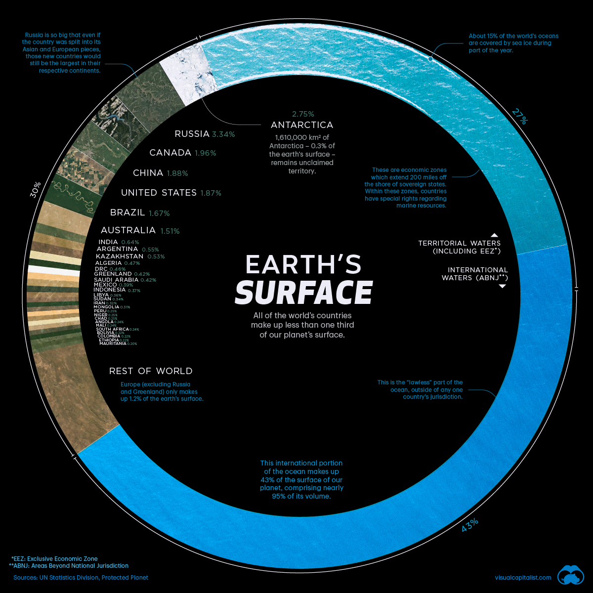
It takes a masterful designer to distill data that encompasses the entire world into one gorgeous, balanced visualization. Not only is the minimalist quality of this chart a breath of fresh air, it also has a lot to teach us about our planet. For example, only 30% of the Earth is comprised of land mass. Everything else is restless, roiling ocean; over 80% of the world’s seas is uncharted, and 43% of it is lawless, or outside of any country’s jurisdiction. Russia by far possesses the highest percentage of the Earth’s surface at 3.352%, with Antarctica coming in second with 2.745%. Despite the incredible size of these continents, it is bewildering to compare them to the magnitude of the oceans. If you want to trigger an existential crisis, think about all of the deep sea creatures swirling around pitch black waters that we have yet to find. In fact, scientists estimate that 91% of ocean species are unclassified or never seen. What a wondrous, terrifying, and mysterious planet we live on.
Leave a Reply