Green is generally accepted as the color of success as it represents the same hue as U.S. currency, but do successful companies’ logos reflect that? WizardPins.com looked at the logos of Fortune 500 companies to see which colors were most commonly used. Which color do you think is at the top?
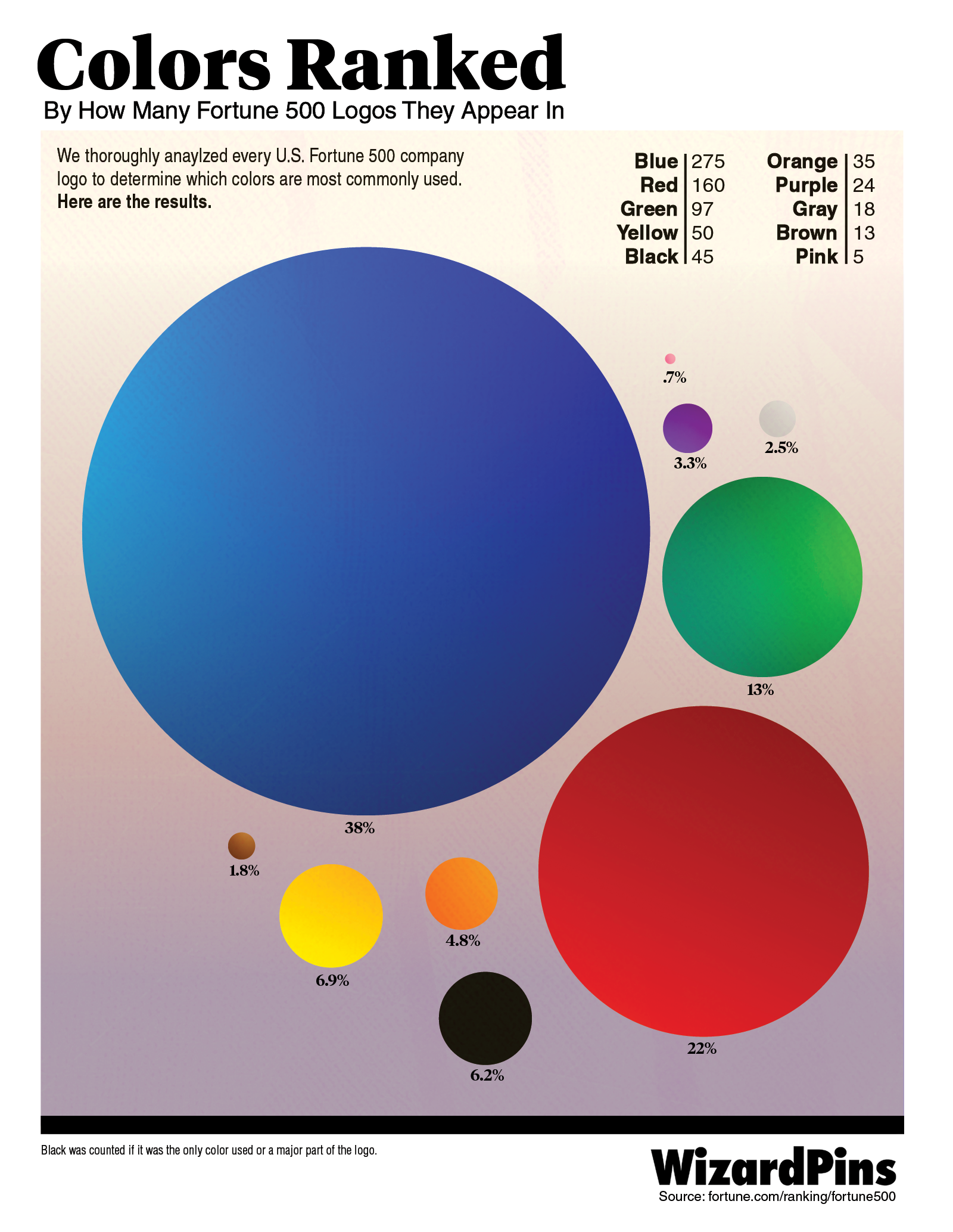
The color that appears in the most Fortune 500 logos is blue, appearing in 275 of the 500 logos. Some of the most popular companies that include blue in their logos are IBM, Meta/Facebook, Pfizer, Boeing, Lowe’s, and American Express. Why is blue such a popular color to include in logos? There have been many studies that measure how different colors make consumers feel. The color blue tends to lower user’s heart rates and produce a calming effect.
The second most prevalent color in Fortune 500 logos is red, appearing in 160 different logos. Red has long been a popular color in the restaurant industry, as the color has been thought to spur hunger, excitement, and appetite. Companies that famously include red as part of their logos include Target, Alphabet, Costco, and Tesla.
The third color that appears most often in Fortune 500 logos is green. The color green is prevalent in 97 different Fortune 500 logos including Publix, John Deere, and MetLife. Green logos are meant to represent renewal, success, luck, and freshness.
Ranking fourth is yellow, which is utilized in 50 Fortune 500 logos. Yellow is also a popular color for restaurants to use in their logos as it evokes warmth.
Leave a Reply