Data doesn’t need to be visualized in a boring way in order to be easily digested and understood by your readers. In fact, this might lead to it not being read at all. Before you decide on publishing your information in a bland bar graph or a generic line chart, take a moment to explore some other options!
These three examples of data visualizations will prove that you can convey your data in a way that is easy to understand, while also keeping the interest of your target audience. Please note that not all of these visualization types will work for every set of data, but with a little research you’ll see there is something for everyone.
A map of the most powerful default subreddit moderators (Node-Link Diagram)
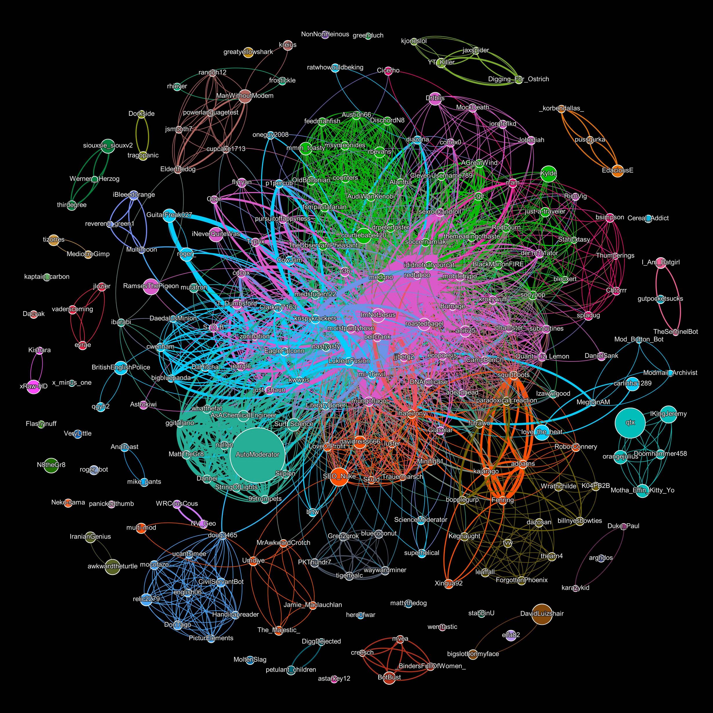 This node-link diagram was created by Reddit user /u/larperdoodle. It shows which Reddit users are moderators of the most subreddits (by how large their circle is) and lines to indicate which mods are connected by sharing a common subreddit. The result is a beautiful visualization that exposes the small handful of moderators that control Reddit’s default subs and, in turn, the vast majority of the website’s users.
More from /u/larperdoodle
Comment from discussion [OC] A map of the most powerful default subreddit moderators.
The Evolution of Video Game Controllers (Tree Diagram)
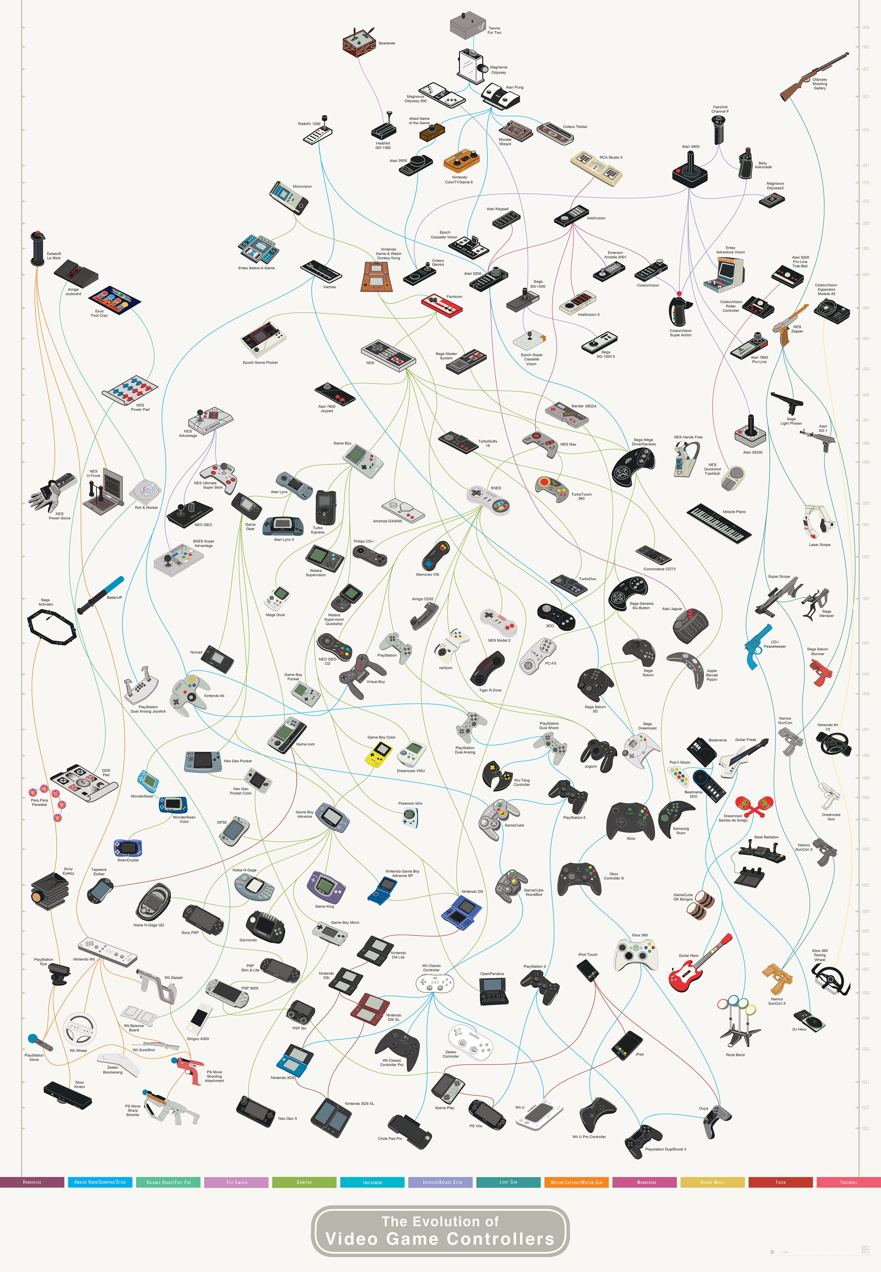 This simple, but interesting visualization made by Pop Chart Lab is known as a tree diagram or a family tree diagram. It shows video game controllers starting from the very beginning of the gaming industry in the 1950s. You’ll see how early examples of video game technology led to advancements in technology and influenced companies to develop the industry into what it is today. All of this is achieved in the visualization by drawing connections between similar technology as it becomes more and more advanced over time. One example is the Playstation 4 controller that can trace its influence back to the Radofin 1292 controller from 1976.
This is Your Body and Mind on Drugs (Illustration Diagram)
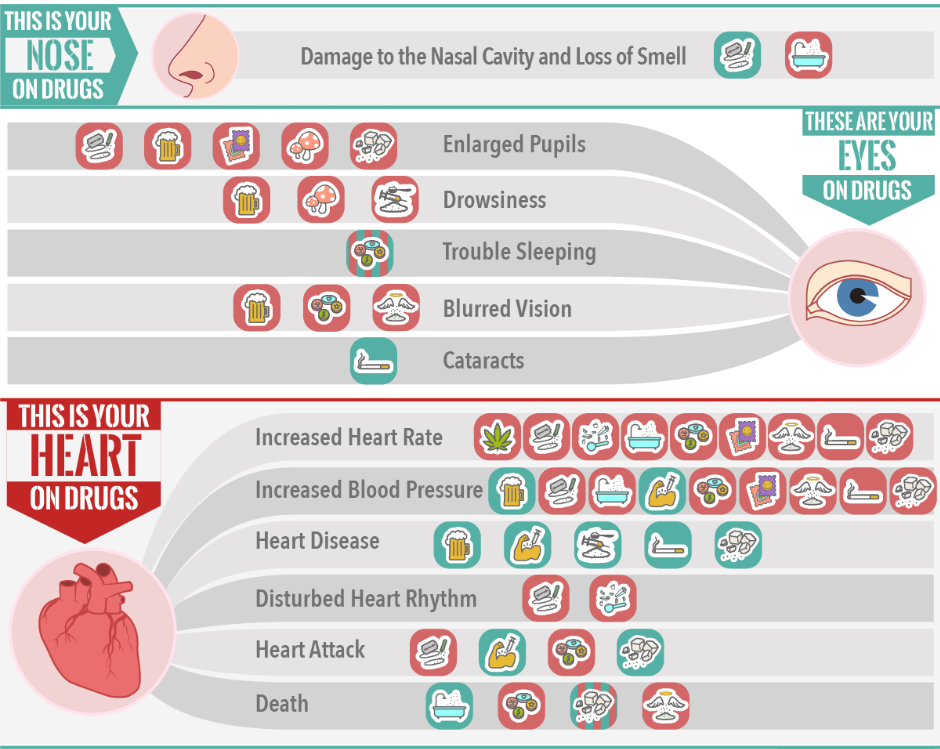 Sometimes an illustration diagram focusing almost entirely on images is the best way to get your point across in a fun and interesting way. By doing away with cumbersome text, you’re also making the visualization much more easily-digestible. This is precisely what True Recovery did with this visualization. It shows which drugs and illicit substances affect different parts of the body in both the short and long term. In the end, the visualization compares 14 parts of the human body with 14 different drugs including marijuana, cocaine, heroin, and even krokodil (desomorphine). Above is just a small sample of the visualization and we recommend checking out the full thing here.
Taking a few extra minutes to brainstorm the best possible way to visualize your data can really pay off.
Leave a Reply